Case Studies
Client: Newmarket Public Library
The Problem
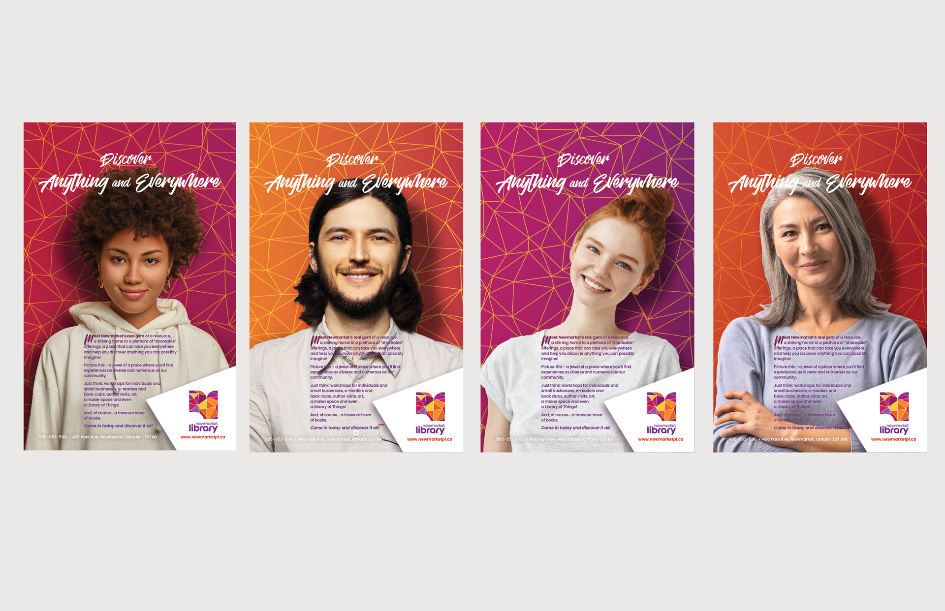
As one of Newmarkets’ lesser known destinations, NPL needed a striking visual brand to help position them as the major community asset they are, break out of the clutter, and celebrate their staff, community and city.
Process
At first glance ‘lesser known’ seemed like a shortcoming. However, it was the repositioning of this perceived weakness as a strength that was the springboard for all that followed.
What Works
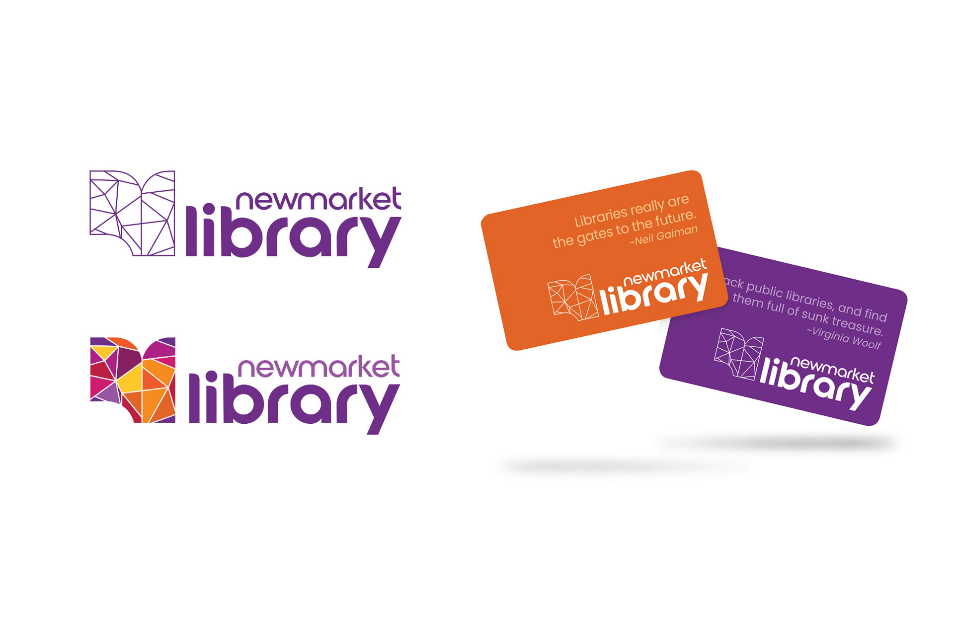
‘Lesser known’ became a ‘hidden gem’ just waiting to be discovered, sure to delight newcomers and returning patrons alike.
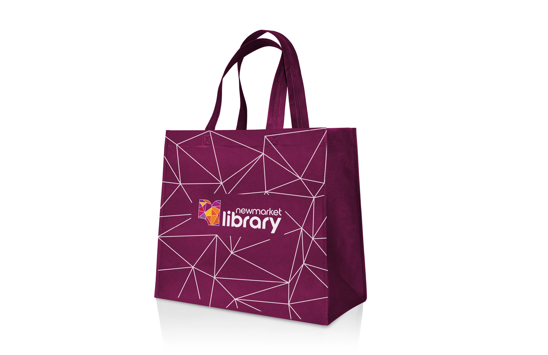
The logo, with its refracted and gem-like facets, represents their desire to have every engagement be a quirky, charming and feel-good experience. The multi-coloured facets ties in with the library’s desire to be a richly storied community hub, filled with abundant opportunities.
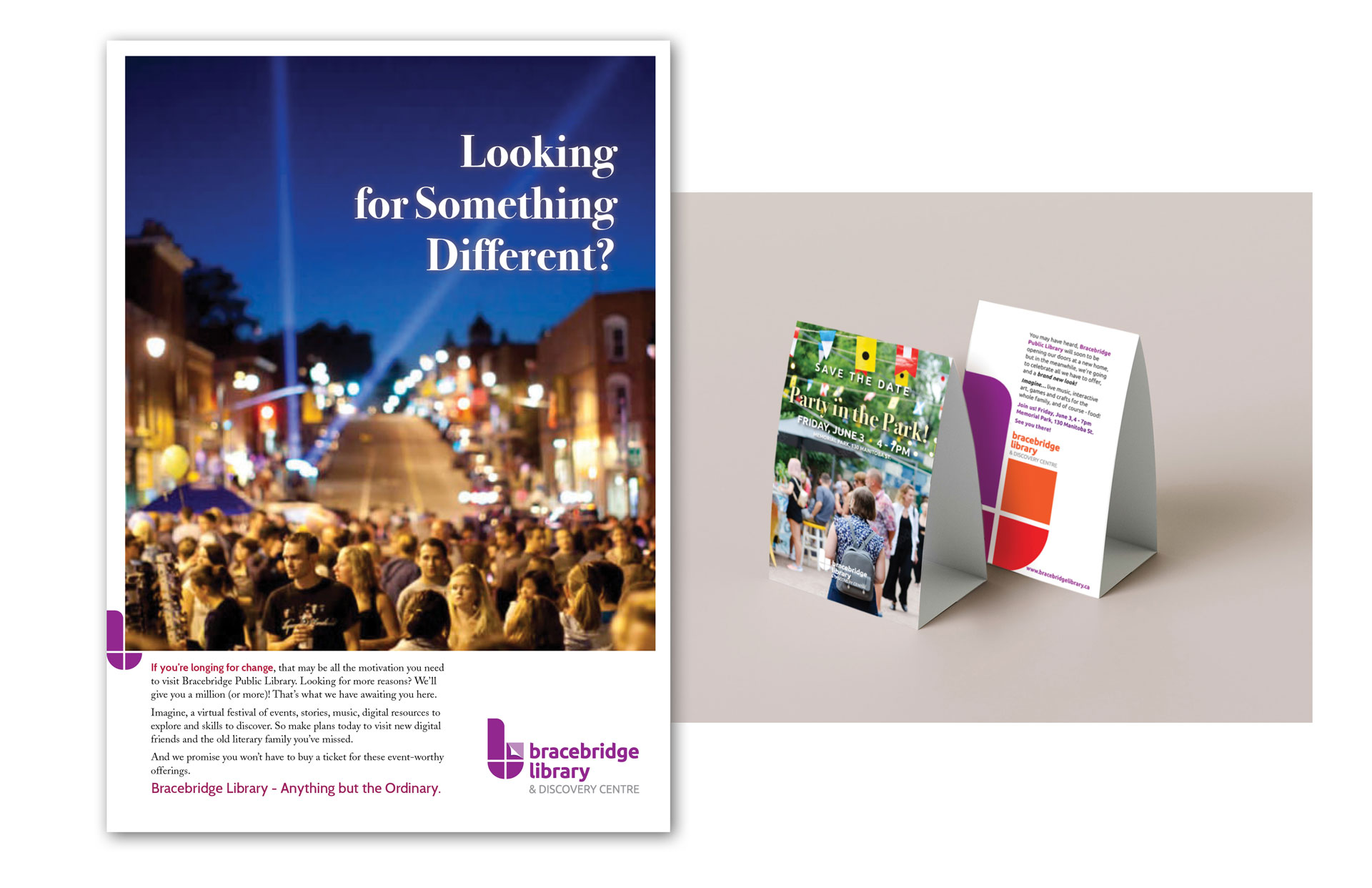
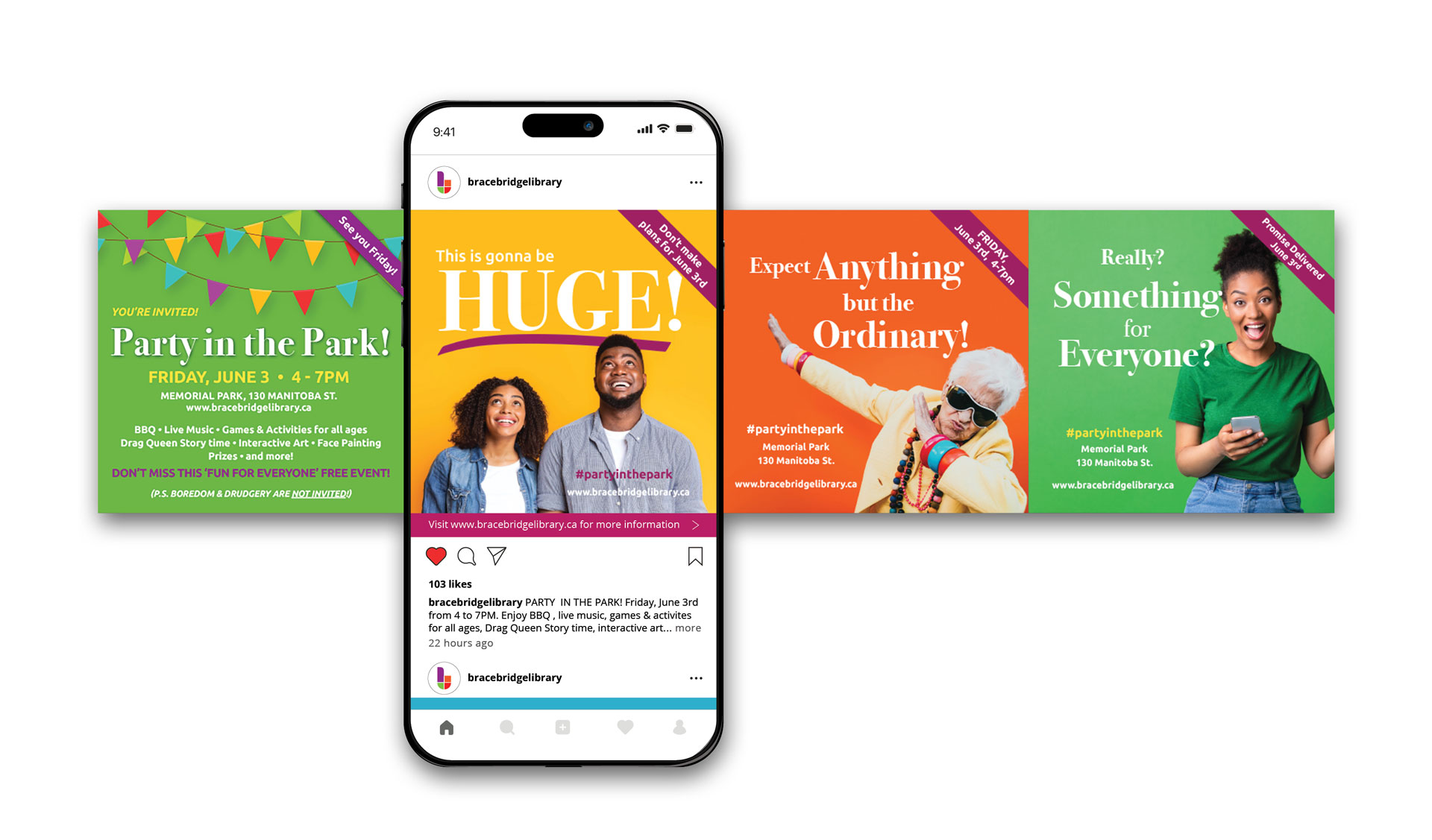
Client: Bracebridge Library
The Problem
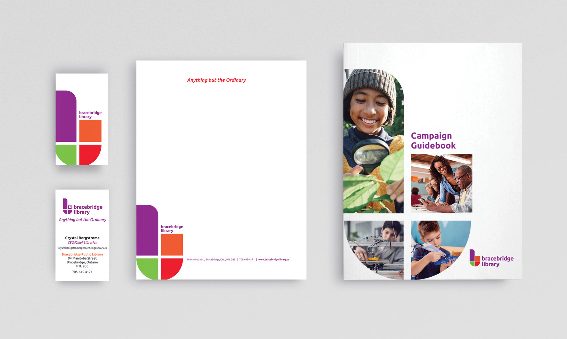
In anticipation of moving to a brand new space, Muskoka’s Bracebridge Public Library brought in Hardie and Company for a complete re-brand. As an essential community hub, the library needed to create a fresh new look that better reflected their new home and their ongoing commitment to offering the best services, programs and opportunities to the community.
Process
Branding sessions and workshops with key stakeholders and
staff led to the discovery of the library personality traits that
would shape their actions going forward. The inclusion of staff
and board members made for an enthusiastic roll out as
everyone felt personally invested.
What Works
This Brand Personality calls for strong colours, active images, and the idea of multiple opportunities...all to engage and illustrate who the Library strives to be as an organization:
Wonder - Aim to deliver a feeling of surprise caused by something beautiful, unfamiliar, or inexplicable
Audacious - Show a willingness to take bold risks
Brave - Have mental and moral strength and stand ready to face unexpected challenges without fear